Mystery Island

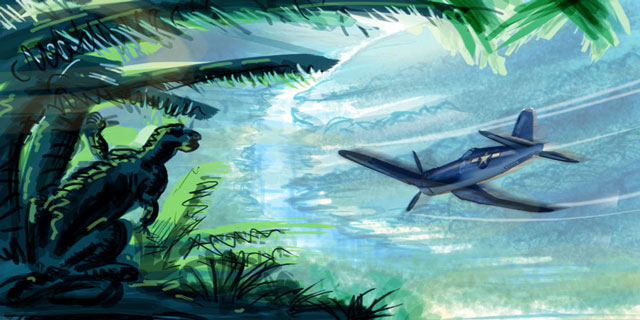
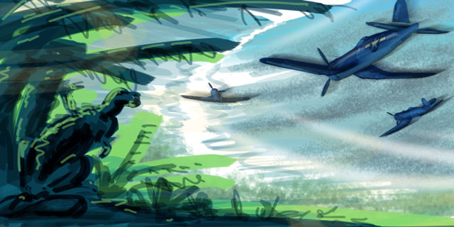
More Photoshop painting fun. Inspired by the book The Art of Ray Harryhausen. I loved the way he assembled a scene in those old stop motion films. Layering live action, stop motion animation, models, and paintings into an exciting, cinematic composition. The critter in the foreground is based on an unfinished rough sketch of Ray's that is featured in the book.

Click for larger image
I did a few rough sketches before staring to try and work out the colors and composition:


I took screenshots of my progress at certain intervals to show how the scene was built up. I started with a rough sketch (several actually) then I began to fill in large areas of color. Used Photoshop to paint in the details. Some of the more tedious plants originated in Illustrator and the plane was a 3D model I found online. I altered the texture map to look more painterly and rendered it in Cinema 4D. Brought that render into Photoshop and painted in extra details to match the scene:


And finally a few actual size closeups showing the painted details of the individual areas:


Boulder Dash Label

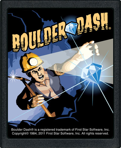
Contest entry for a video game label design. Didn't win but it was fun and quick.

Main Label

End Label

How many albums can you name?

Mostly rock and metal. Some classic, some obscure.

Sweet Tooth

A fun project I did for work @ GMR earlier this year. The idea was to create a touring version of the Twisted Metal video game character Sweet Tooth that allowed people to try out the game.


Seymour Duncan Metal T-Shirt Contest

My entry for the metal category. \m/  >_<  \m/

Seymour Duncan Vintage T-Shirt Contest

Here's my entry into the "vintage" category for a T-shirt contest for Seymour Duncan. I hope to have a concept for the "metal" category sometime soon too. Deadline is May 31st noon so I need to stop blogging and start drawing!

Full back:
Mockup of front & back:

How well do you know your guitar gear?

A little guitar gear quiz I created for a gear forum. How many iconic gear shapes can you name?

Answers here.

Steampunk Airship Final

I didn't win but it was still fun. The winners took a much more traditional approach to the genre. Cool challenge! No Photoshop or post work was allowed so I had to resort to other solutions for the lightning glow and rain effects. Below were my final renders:


Steampunk Airship WIP2

I think this is nearly complete. I'd like to add some secondary action spots somewhere. Maybe some floating mines, spotlights or something to help add a little more impact to the overall composition. But the ship itself is largely complete. The contest allows for 2 different rendered views so I'll start thinking about how else to best showcase this. Maybe an interior shot?

Steampunk Airship Challenge WIP

4 views
3/4 view
Interior
Work in progress for my entry into the C4D Cafe Steampunk Airship Challenge. Almost everything I know about steampunk was learned by watching 20,000 Leagues Under the Sea. So unlike many of the typical balloon and propellor powered entries I'm seeing I wanted to take a Nautilus-like approach. A big, metal, bird-shaped craft powered by harnessing electricity. Having said that, some of the other entries that have chosen a traditional ballon and propeller approach are looking quite nice and do seem more appropriate to the genre. No post work will be allowed for the contest so I've been experimenting with Cinema's Highlights filter to create the lightning effects.

Undersea Explorer

And I think this is finally complete. Verne is off to explore the strange wonders and worlds under the sea.


Verne

As in Jules. I think this is the guy that will be piloting the undersea ship.

Undersea WIP3

Almost done. Just need to add the character. I think I'm going to do some sketches to see what he shapes up like. Once the pilot is painted in place I want to do a few paint touch-ups to the rest of the image to integrate it better.

Undersea WIP2

An update to the undersea backdrop. Introducing a little more color in the foreground. This should help give extra depth and interest to the ship that will eventually be traveling these waters. The plan as of now is to composite the final image in four main layers. The main background, the ship, the character piloting the ship, and the volcano in the foreground. I really want to try to "paint" the character by hand so it doesn't look so 3D and robotic, hence the composite approach to this.


And here's the original one again for reference. I quite like the softness and blur of the original.. I'll have to reintroduce some of that.


The Generic Car Project


This was an interesting project just completed. Assignment was to design and build a generic car with equal parts luxury & sportiness. Car would then be featured in mock commercials shown to focus groups. One commercial would feature a classical, the other a rock soundtrack. People were asked whether or not the music swayed their opinion about the product. Did the classical music convince you this was a luxury vehicle? Did the rock music make you think it was a sport vehicle? The findings of that study were then presented at a music marketing conference.


We couldn't use an existing model since people may have had preconceived ideas about actual models or manufacturers that would sway their opinions. So we started sketching some rough ideas. I decided on a crossover vehicle: Part sedan, part SUV, all generic.


Once I settled on an overall shape I did a few variations to refine my concept. We went over all of our sketches and narrowed it down to 3 choices. Each of the choices had design characteristics that reminded me of different manufacturers so internally we referred to them as the Jeep, Mazda & Chrysler.
The Jeep was thought to be too rugged and masculine, the Mazda too curvy and modern, and the Chrysler design seemed to be mediocre, mundane & generic in all the right amounts.


After about a week of modeling the "Chrysler" began to take shape. It evolved a bit from the concept because it was looking too retro. I still don't know if that was an accident or subconsciously I wanted it to evolve that way since it's what I like. That acorn looking badge is supposed to be a shield with motion lines coming from it. An attempt to say luxury and sporty. A few more hours of tweaking the textures and scene and the first luxury, sporty, generic, utility, retro, almost looks like a hearse, crossover, mediocre mobile rolled off the line. 


Ship WIP2

Update to the Jules Verne inspired ship. Mostly interior stuffs. That robot guy is just a placeholder to help establish proportions. I eventually picture him looking like a cross between Vincent Price with mutton chop sideburns and Doctor Who's third incarnation Jon Pertwee. Maybe even a cartoony style?

Tiki Island


I created this for a video invitation to a tiki party a while back. It grew out of the tiki lounge model I had previously created. Video below.

SDUGF Riff-Off

A few months back I entered a couple guitar riffs into the Seymour Duncan User Group riff-off. The riff-off was a tournament style challenge where members voted on their favorite entries. Entries were due quickly and had to be limited to simple guitar riffs, not entire songs. These were my entries. I didn't get very far in the riff-off but it was a fun exercise. The first one received some good feedback and the second one was quickly recognized for what it is: a half-asses riff that was more concerned with replicating Robin Trower's guitar tone. Riffs were recorded using my Fat Strat in Garageband with the Pod Farm plug-in.

Riff 1 mp3


Riff 2 mp3

Tiki lounge jam cam

I'm in the middle. That's Randy on the left, Scott on drums.
This is an older project I created a few years ago. A stylized, 3D model of my basement tiki lounge/jam space. I get together with friends occasionally for drinks, games and loud noise in the lounge. I use the model to create "jam cam" email reminders announcing the next jam date.

The actual basement tiki lounge/jam space

Ship WIP

Sort of a Jules Verne vibe to this one. When this one grows up it'll live underwater.

Pixel circuit design

Undersea: The second frontier

Speaking of obligatory pics, another work in progress. I have tentative plans for this one as an environment for a concept ship contribution I'm working on. I recently discovered that site and hope to be able to contribute something. Great images and lots of talent there.

Space: The first frontier

The obligatory outer space pic. Work in progress. Experimenting with textures to achieve a more painterly, not -so-digital look to renders. I imagine I'll be revisiting this as a background for other images in the future.


Zero

Lancia Stratos Zero. A fun, 3D modeling project I worked on during the 2010 Holiday break.
Not an exact replica but a good exercise in hypernurbs modeling in Cinema 4D.
The bottom image is available as a poster.